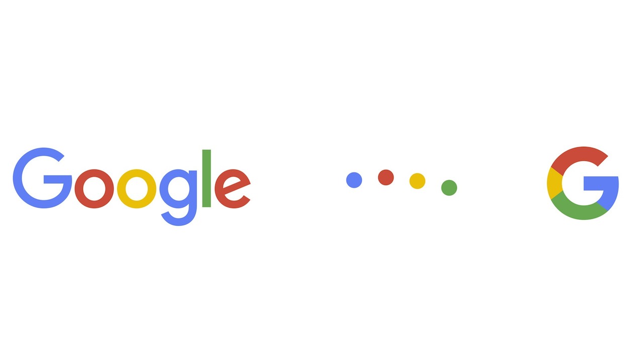
Google’s new typeface (screenshot via YouTube)
Type history is full of aesthetic changes that respond to evolutions in technology or the need to adapt to a new scale. One such change was the early-19th-century rise of the evocatively named “fat” or “Egyptian” typefaces, which were bold, ultra-thick letterforms that could be read with ease from a distance. The advent of the cylinder press in 1812 allowed advertisers to producer bigger posters than ever before, more quickly and in greater quantities, necessitating the development of a typeface that could capture the attention of passersby on a busy London street. This change, as in so many other fields, also marked the shift from handcraft to industry in print and type — part of a decades-long period during which these two impulses duked it out for cultural relevance, accessibility, and economic supremacy.
The idealistic founders of the Bauhaus were keen to find ways to humanize the Modern, and to democratize good design. In 1925, Herbert Bayer created one of the most influential experimental typefaces in history, but it was never cast into real type, meaning — in those analog days — that it only existed as a design. Inspired by colleague Jan Tschichold’s (1902–1974), Bayer’s landmark type manifesto “Die Neue Typographie” [The New Typography] (1928), which advocated a system of interchangeable letterforms, set out to create a typeface that was “universal,” that could be deployed in a variety of creative ways, at different scales. Each element was lowercase, so that the typeface could be adapted to typewriters, books, posters, and signage — in other words, all the ways in which we interact with type on a daily basis as we navigate the world. The premise that each letter was the same “weight” in typographic terms, that is, the same thickness, meant that each character was interchangeable and thus the process of design and implementation was simplified. Bayer’s original design now exists as Bayer Universal, and inspired the related typefaces Architype Bayer and Architype Schwitters.
Google’s new face, “Product Sans,” faintly resembles Bayer’s Universal Alphabet in its heavy, rounded forms, each of which seems to “fit” in a circular fashion over the footprint of the other. The video that accompanied Google’s announcement of its new graphic identity features a lovely animated explanation of how the typeface was born, and in an elegant sequence of dancing dots that would make Herbert Bayer’s heart sing, the letterforms take shape out of basic, universal forms: uniform spheres in red, yellow, green, and blue that can be “squared” for use in icons, then turn into rounded letterforms.
Why do this at Google, and why now? Bayer and Tschichold, along with their Bauhaus colleagues like architect Walter Gropius, addressed the struggle to reconcile the human, tactile, and affective experiences of design with the aesthetics (and recent ravages) of the Machine Age. How could people expect to navigate a world that was made of cold materials on a giant scale? Though the concerns of World War I-era Europe seem less pressing now, the spirit of those worries is as relevant as ever: our connections to other people, in ways both good and bad, are mediated by technology, gadgets, and data, from our physical location on earth to the way we “appear” online to others. Google’s breadth and scope essentially makes its array of products the 21st-century equivalent of Modernist architecture or mass production: Google is everywhere, unavoidable, greatly beneficial if used right, and it requires the finesse of forward-thinking, humanist designers to make it accessible.
Even if you’re not a type nerd, on some level you know just by looking at it what Product Sans is about. “It’s approachable and friendly,” design critic Alexandra Lange told Hyperallergic, “more interesting typography than the original but still not standing out in any way. The one mark of character is the jaunty E. The colors combined with the Alphabet parent company lead me to interpret it as ‘quality’ children’s toy branding.”
Then, of course, there’s the eternal thrill of putting serifs out to pasture; decade after decade, that never gets old.

Δεν υπάρχουν σχόλια:
Δημοσίευση σχολίου